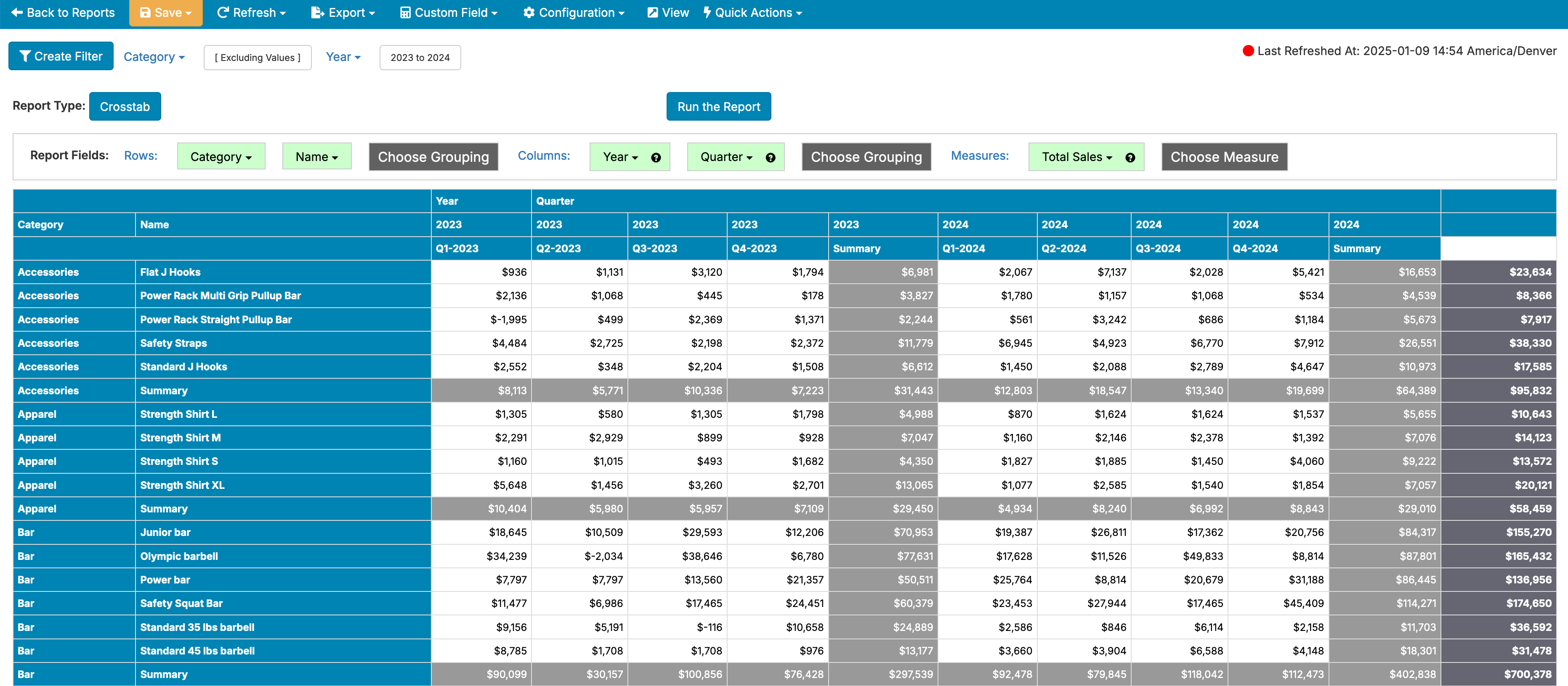
Crosstab reports allow you to look at the combination of multiple Groupings and Measures to look for particularly meaningful combinations within your data.
In this example, you can see how much new business each sales representative has generated for each month of the year.
Within the report editor, you can drag groupings into the Row drop area and they'll appear along the vertical side of the report. Drag groupings into the Column drop area and they'll appear across the report horizontally. Finally, add measures to the the Measure drop area to choose just what numeric value you're evaluating in the crosstab.
By default, crosstabs will aggregate rows and columns so that you have a per row total for all rows and a per column total for all columns. You can turn these summaries off by going to Configuration -> Report Properties -> Formatting and toggling 'No Row Summaries' to on to hide row summaries and toggling 'No Column Summaries' to on to hide column summaries.
If you have two column groupings, for example Year and Quarter, you can choose to toggle 'Summarize Columns' under Configuration -> Report Properties -> Formatting to add an additional summary column for each Year. You can use 'Summarize Rows' to do the same for the first row grouping if you have multiple row groupings in your crosstab:
The following properties are set in the Report Editor -> Configuration -> Report Properties -> Formatting.
The following properties are set in the Report Editor -> Configuration -> Report Properties -> Color Scheme.